
Putting the offer before the price to help visitors understand, evaluate and enquire
Taxation Made Easy
Jump to results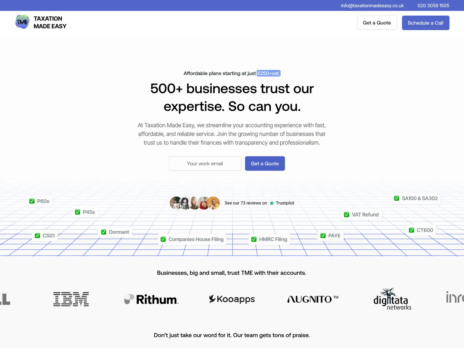
A value-first redesign, followed by a reported lift in conversion
After launch, the founder reported a 30% increase in conversion rate compared with the previous 30 days. We didn't have analytics access after launch, so the figure comes from the client.
- +30%Conversion rate (founder-reported)
A successful firm. An unclear online offer.
Taxation Made Easy is an established UK accountancy firm working with real estate businesses and small businesses. It already had a working sales pipeline, but wasn't sure its website reflected the quality of its services.
The website needed to do more of the work before the sales conversation: explain the offer, make service inclusions clear and help visitors find the quote request.
- Client
- Taxation Made Easy
- Measurement
- 30-day period after launch (founder-reported)
- Platform
- Figma / Wix Studio
- Scope
- Website audit, UX restructuring, Figma design, Wix Studio development
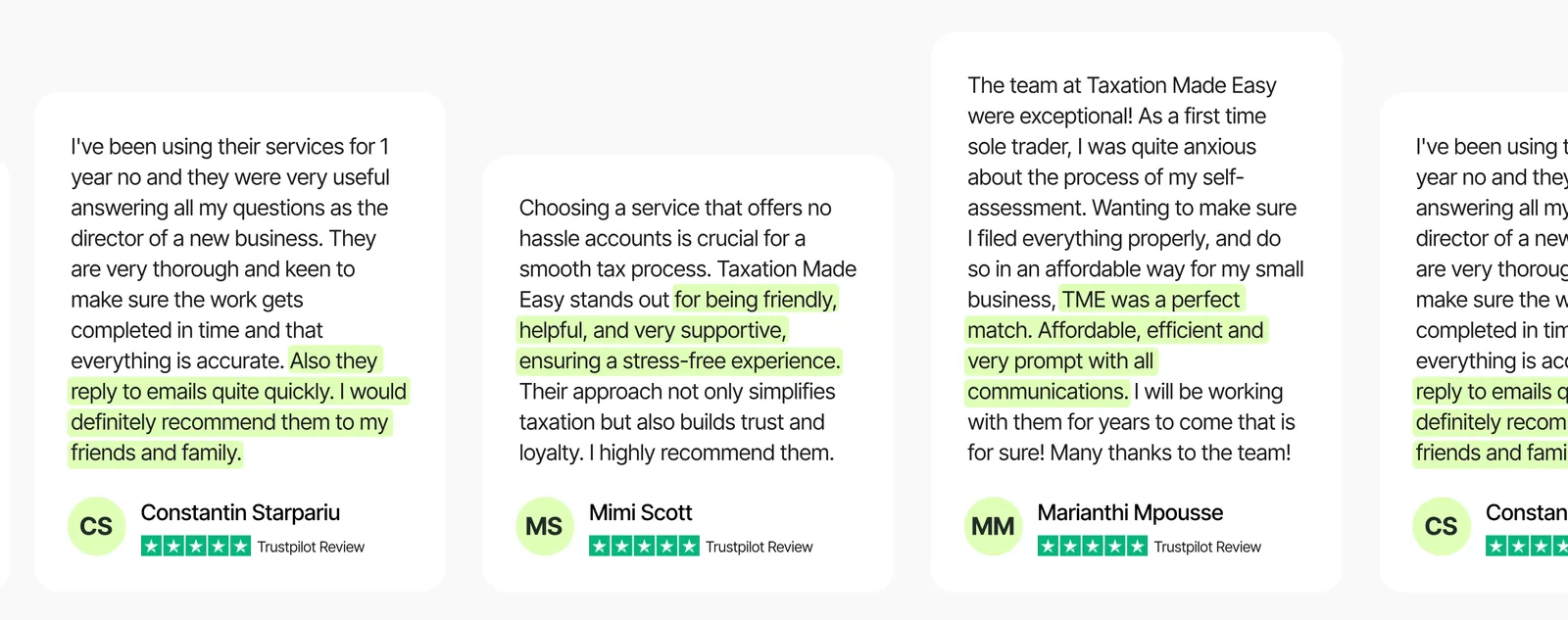
Visitors saw the price before they saw the value
The main issue was the order of information. Pricing came first, and service cards showed little more than a name and a buy button. For someone comparing accountants, a label alone wasn't enough to judge whether a service was right for them.
The website needed to explain the offer before asking visitors to evaluate the price.
- 01Price before context
Visitors had to judge cost before they knew what was included.
- 02Limited audience relevance
It wasn't clear which industries the firm served.
- 03Hidden next step
The request-a-quote form was easy to overlook.
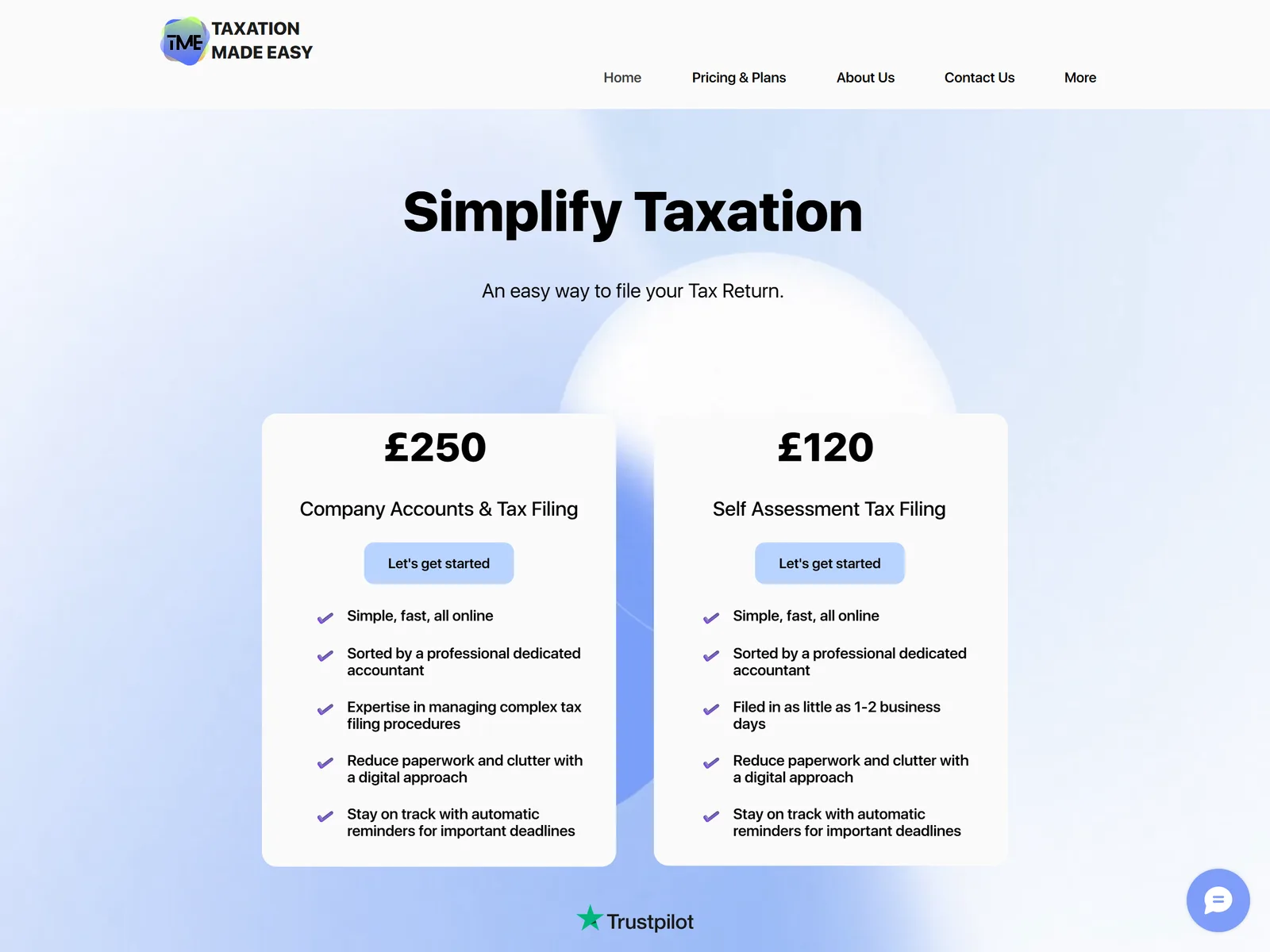 Before
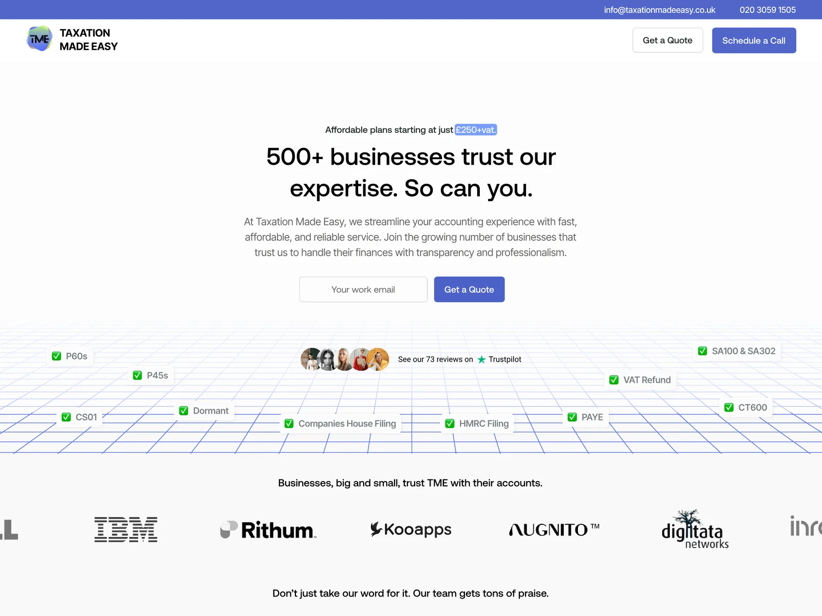 After
Support the decision before asking for the sale
We audited the existing site and found friction across the landing page, the service presentation and the enquiry path. The strategy focused on visitors still getting to know the firm or comparing providers, while the firm's own sales process handled the final stage.
If visitors understand a service and what it includes before seeing the price, they have the context to judge its value and take the next step.
The landing page and supporting pages were redesigned in Figma, turning the audit into a clearer information hierarchy, then built and launched on Wix Studio.
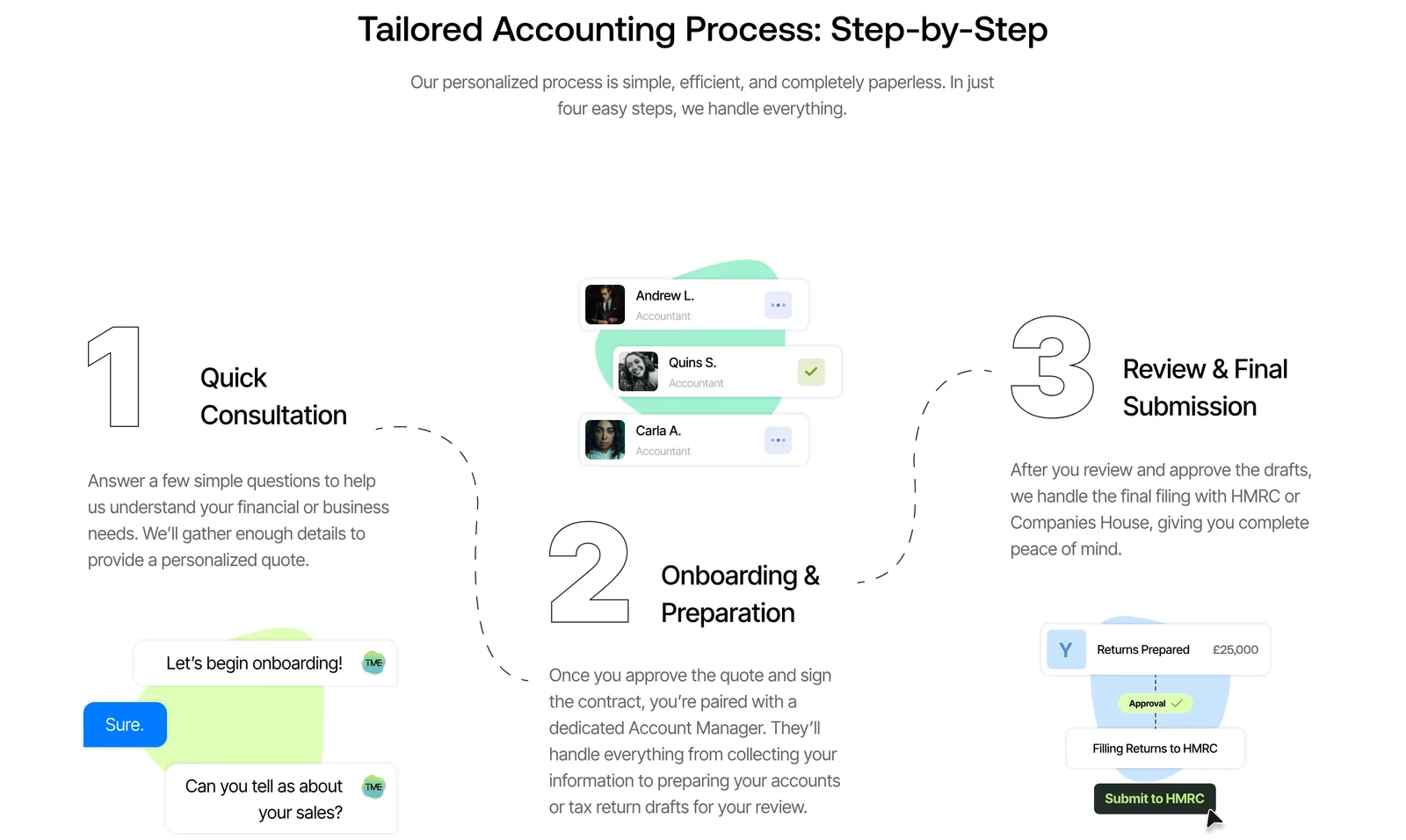
The intended journey: understand the offer → review what's included → recognise the fit → evaluate the price → request a quote.
From price-led browsing to value-led evaluation
Five changes reorganised the site around how people actually choose an accountant.
- 01Offer before pricing
Before: pricing led the experience.
After: the page explains what the firm does and how it works before showing the cost.
- 02Explicit service inclusions
Before: service names and buy buttons with little detail.
After: each service explains what's included, such as self-assessment, payroll and return filing.
- 03Who the firm works with
A new industries section helps UK property businesses and small businesses recognise that the firm understands their needs.
- 04Business numbers made visible
A dedicated section gives the firm's key numbers a clear place on the page.
- 05A stronger route to a quote
The quote request is easy to find once visitors have reviewed the offer.
 Before
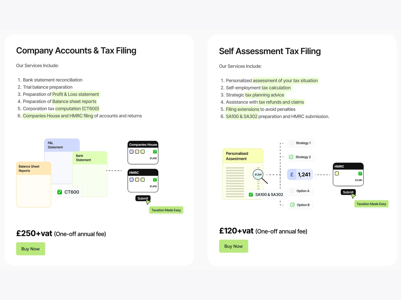 After
A clearer offer. A reported lift in conversion.
The founder reported a 30% increase in conversion rate compared with the previous 30 days. It can't separate the redesign's effect from other factors, but it matches the project's aim: help visitors understand the offer and move towards an enquiry.
Explain the value, then show the price.
For a professional-services firm, the website's job is to answer "is this right for me?" before "how much is it?". Ordering the information that way gives visitors the confidence to request a quote.

- 01Understand the offer
- 02Review what's included
- 03Recognise the fit
- 04Request a quote
A price on its own invites comparison. A price after a clear explanation of value invites a conversation.