
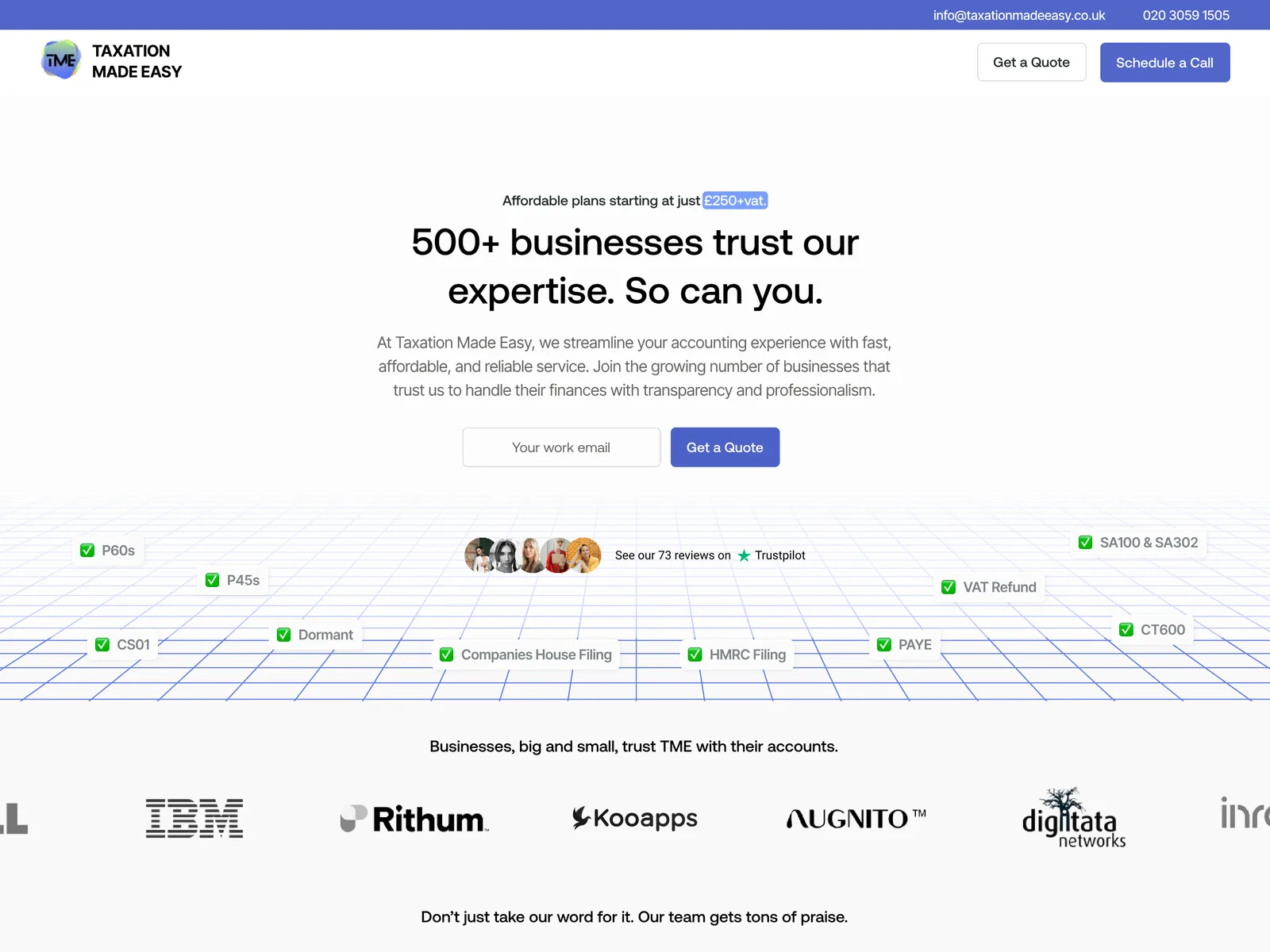
Creating a clearer path from first visit to paying client
Emotion Architects
Jump to results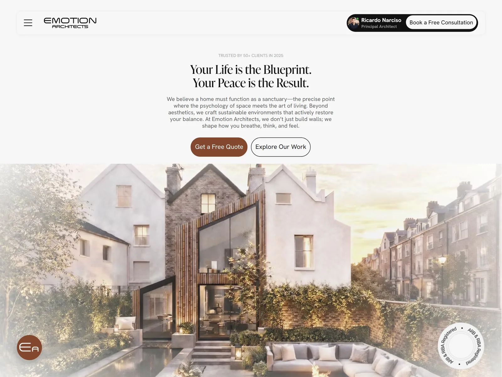
Four leads. Three paying clients. Within 30 days.
In the first 30 days after launch, the redesigned website generated four leads, and three of them became paying clients. It's an early result from a small number of enquiries, reported by the project team, rather than a measured conversion-rate study.
- 4Website leads
- 3Paying clients
- 30 daysAfter launch
A practice with a lot to offer. A website that didn't show it.
Emotion Architects is a UK architecture practice led by Ricardo. The work was strong, but the website didn't explain it: visitors couldn't easily see what the practice offered, how a project worked or how to start a conversation.
The brief was simple to state and harder to solve: help visitors understand the practice, and give them an obvious way to book a call.
- Client
- Emotion Architects
- Measurement
- First 30 days after launch
- Platform
- Figma / Wix Studio
- Scope
- Website strategy, content structure, Figma UI design, development and booking integration
An architecture practice struggling to generate enquiries
The previous website was dated and text heavy, with few visuals and unclear messaging. Essential information about the services, the working process and the offering was missing or hard to find, and the site was producing no enquiries.
Visitors needed an obvious route from interest to a booked conversation.
- 01Information gaps
Visitors lacked a clear explanation of the services, process and offering.
- 02Commercial concern
The previous website was reported to generate no enquiries.
- 03Visual communication
A text-heavy presentation did little to show the practice's work.
- 04Next step
There was no clear path from interest to a booked conversation.
Understand the practice before redesigning the interface
We started with in-depth conversations with Ricardo about the brand, his goals and what the website needed to achieve. Together we mapped how the site should guide a visitor: explain the services, show how the practice works, make the offering clear, then make booking a call easy.
If visitors understand the services, see how the practice works and find a clear offering, they'll feel confident enough to book a conversation.
Every page was designed in Figma and refined with Ricardo's feedback, then built in Wix Studio with appointment booking connected, so the journey runs from learning about the practice to a booked call in one flow.
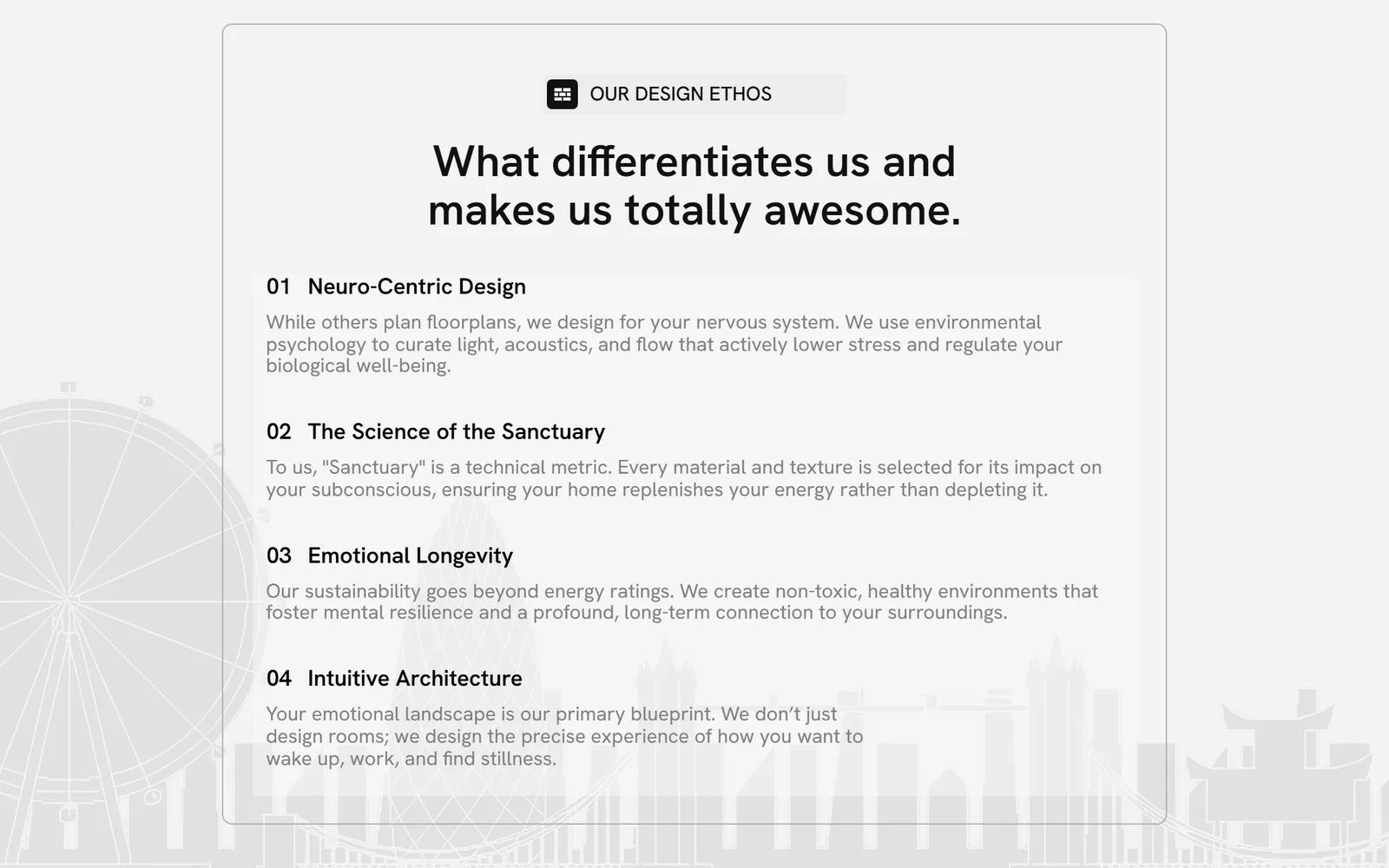
The goal wasn't decoration. It was a faster path from understand → trust → book.
From text-heavy pages to a guided enquiry journey
The redesign organised the website around the questions a prospective client has before speaking to an architect.
- 01Clearer messaging and offering
The services and offering were brought into focus, so visitors could see what the practice provides.
- 02More visual communication
A visual presentation replaced long passages of text to explain what the firm does and how it works.
- 03A visible working process
The site now shows what working with the practice involves, step by step.
- 04A structured content journey
Services, process and offering are ordered to build understanding before asking for a booking.
- 05Integrated appointment booking
Visitors pick an available time and book directly with Ricardo through a connected calendar.
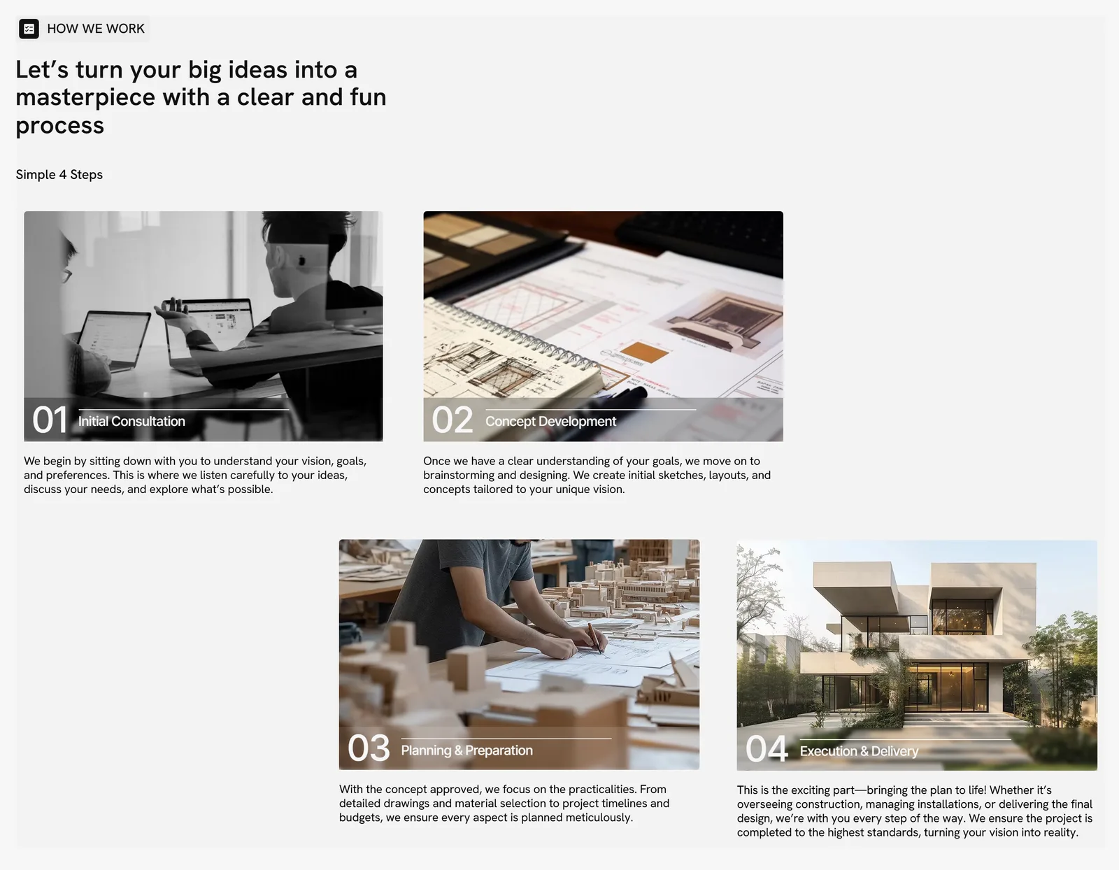
From no enquiries to paying clients.
The previous site was reported to produce no enquiries. In its first 30 days, the new site generated four leads, and three became paying clients rather than one-off consultations.
Clear information turns visitors into conversations.
Instead of asking visitors to piece together what the practice does, the new site answers each question in order and ends with one obvious next step.
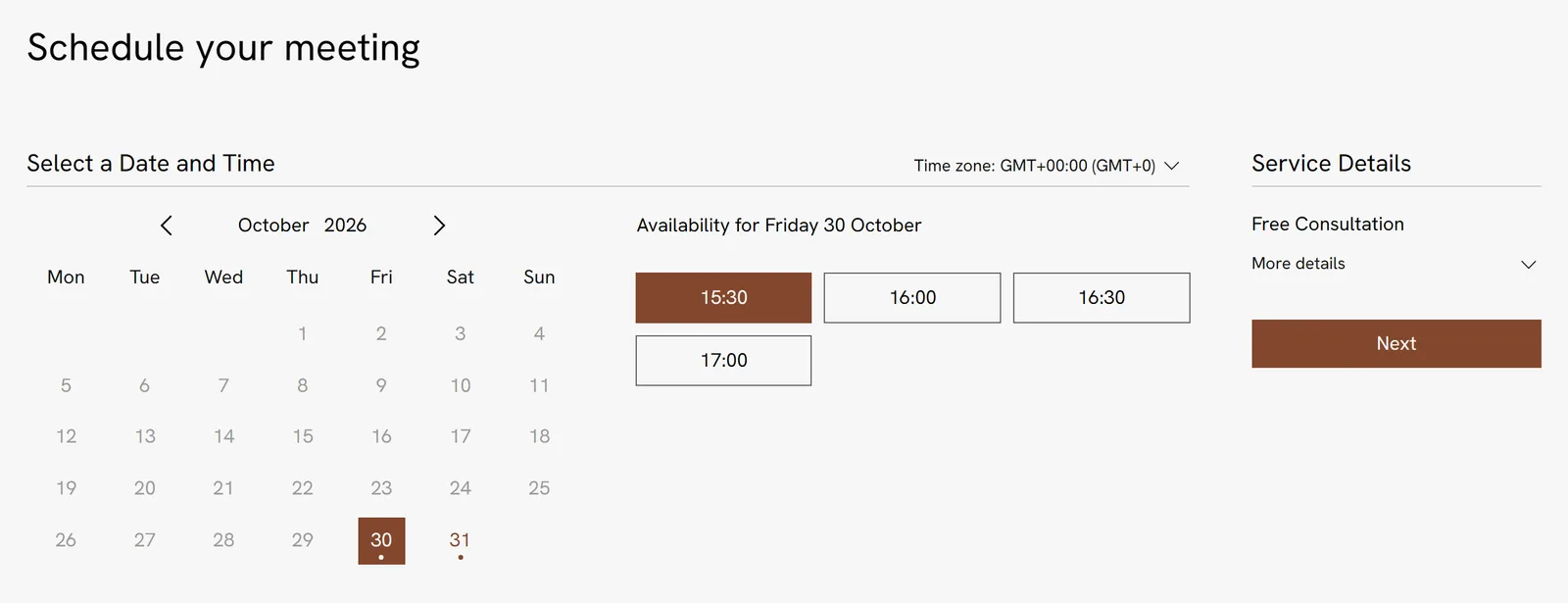
- 01Understand the services
- 02See how a project works
- 03Book a call with Ricardo
People rarely contact a practice they don't yet understand. Explaining the offer first made booking the natural next step.