
From a new travel concept to a connected product experience
Minglar
Jump to results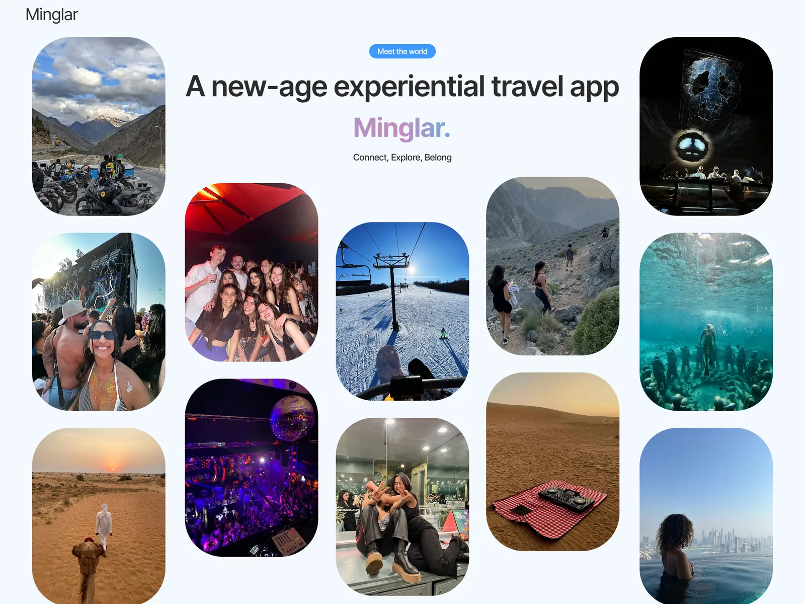
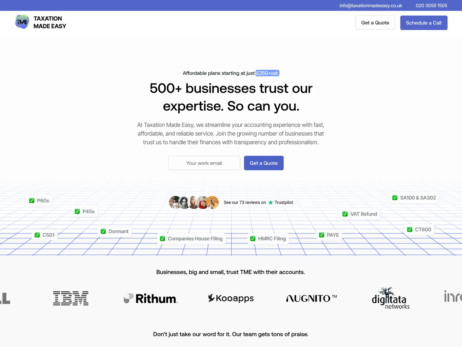
A landing page and a full product design, ready for development
The app hadn't launched when this case study was written, so the result here is the work delivered rather than launch metrics: a live landing page and about 580 reviewed screens handed to the development agency. The screen count and duration are approximate, from the project team.
- ~580Screens designed (approx.)
- 6 monthsEngagement (approx.)
- 4Product interfaces
A new travel idea. No product to copy.
Minglar is a Singapore-based travel venture built around connecting, exploring and belonging. Because the concept was new, there was no established product the team could use as a reference.
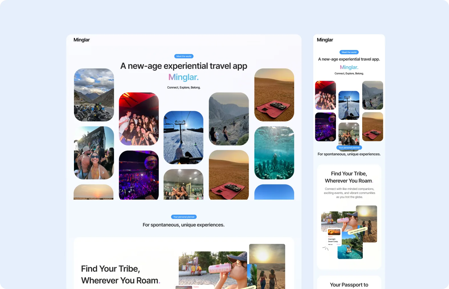
We started with a landing page to introduce the idea, then the work grew into UX/UI design across the whole product: a user mobile app, a web portal, an operator app and an interface for the Minglar team.
- Client
- Minglar
- Measurement
- Delivery scope (pre-launch)
- Platform
- Figma (product design) / landing page built by Grivo
- Scope
- Landing page design and development, UX/UI design for four product interfaces, prototyping and development handoff
Make a new concept understandable and usable
Before launch, Minglar needed to explain what it was building to people with very different interests. Then the founders' ideas had to become journeys that they could review and a development agency could build.
How can a developing business idea become a coherent set of journeys that the client can review and a developer can implement?
- 01Explain the idea before launch
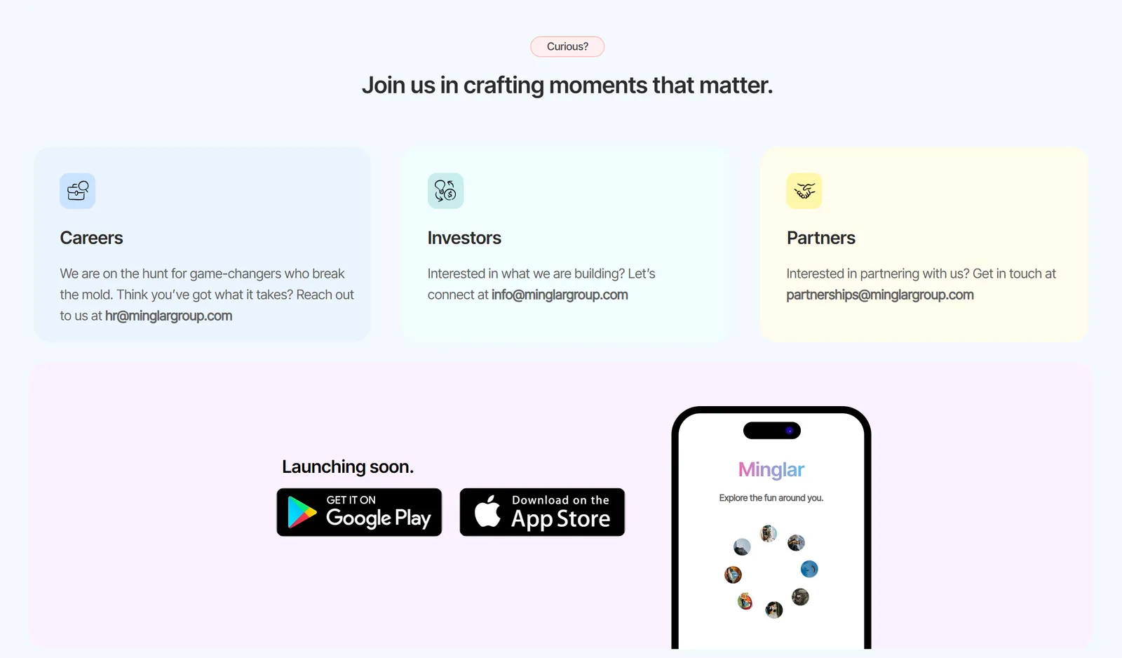
Investors, potential partners and general enquiries each needed their own next step.
- 02One product, four interfaces
Each app and portal had to work as part of a wider ecosystem, not as standalone screens.
- 03Complex features
Some features needed careful thinking through with the founders before they could be designed.
Work through each feature together, in Figma
The project ran on collaborative group calls. For each feature, the founders explained their priorities and concerns, our designer added their own critical points, and we explored the interface in Figma during the call itself.
Designing live made the conversation concrete: everyone could discuss an actual screen and its sequence, not just preferences.
Discuss the feature. Explore it in Figma. Surface concerns. Prototype the journey. Review and finalise. Hand it to development.

Collaboration and review with the founders. No formal user testing is claimed.
From an introductory page to a wider product ecosystem
Two scopes, with clear ownership: Grivo designed and built the landing page, and designed the product interfaces for a separate agency to develop.
- 01Landing page
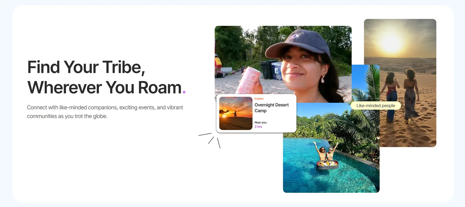
Designed and developed by Grivo to explain the concept, with calls to action for investors, partners and new enquiries.
- 02User mobile app
UX/UI design for the app travellers will use.
- 03Web portal
UX/UI design for the web version of the product.
- 04Operator app
UX/UI design for the app used by operators.
- 05Company interface
UX/UI design for the Minglar team's own interface, plus a shared design system and prototypes for handoff.
A product designed and ready to build.
Over around six months, the engagement delivered about 580 screens across the product, reviewed with the founders and handed to the development agency. As the app is pre-launch, no usage, conversion or revenue figures are claimed.
New ideas need shared thinking, not just screens.
When there's nothing to copy, the design process is how the product gets defined. Working through each feature with the founders turned an evolving idea into journeys a development team could build.
- 01Explain the idea early
- 02Design each feature together
- 03Prototype and review
- 04Hand off with confidence
Designing in the room with the founders surfaced concerns early, so the final designs reached development already reviewed.